
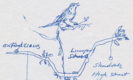
When I’m often asked to describe Sick Chirpse, the first things that come to mind are usually: ‘cultured’, ‘urbane’ and ‘ worldly without an overt sense of pretension’. In an attempt to keep to this perception, I decided that I should bring myself up to speed in the latest happenings in the art scene. After all, nothing is more likely to get you into bed with someone than a lengthy, arousing discussion on the merits of Tracey Emin’s latest work, her scribbling of the Central Line. Just look at it (below), it’s artistry that only a national treasure is capable of. I just hope she got paid a substantial amount of money for it.
So, sashaying on. After successfully accomplishing my principle goal of eating a nice burger in central London, I was left with an open return ticket and a few hours to kill. Despite wanting to take part in most sane people’s preference and see some dinosaurs at the Natural History Museum, I realized I was a gigantic 2 miles (3.21K) away from it and sadly opted on the shorter distance of the Tate Modern.
There were a plethora of things on offer but I decided on picking the forth floor’s exhibition as the others were over a tenner — I’m not an idiot, I’d just spent that much on a delicious burger and wasn’t about to spend it on some private-school kid’s narcissistic, ‘look at me’ project. However, I was still willing to probe/mock it scrupulously if it was free. The exhibition was called, ‘Energy and Process’ and claimed to be a look at the art world’s idea of ‘transformation and natural forces’. These are my findings:
1.
")
Sadly, I neglected to write down the name of this piece, but I can only assume it is titled, ‘levitating pile of dung above a ring of clay’. Now, I didn’t mind this effort, as it appeared to have a good message: shit can land on you from anywhere. Also, the terracotta appeared as if it was about twenty years old so I assume it took a while to make, so I commend this.
As such, I give this one 4 out 5 ‘Arts’ — which is pretty arty isn’t it?
2. ")
Again, I didn’t catch the name of this piece but it excited me greatly. The endless minutes it must have taken its creator to tweak the massive sheet so it was fully symmetrical must have driven him/her to the verge of insanity. For the sheer time owed to coming up with the concept and its construction, I have to laud it, regardless of how little it says.
Therefore, it gets a moderate 3 Arts out of 5.
3.
")
This one is called ‘8th Paper Octagonal’ and was made in 1970. As you can see, it is an unconventional eight-sided shape (or octagon if you will) painted against the Gallery wall in a slightly lighter shade of white. Genius. What more can be said about this apart from the obvious (that it’s a blatant seething attack on anti-abortionists)? Art is expected to push boundaries and make one think. This does both.
I could talk about it for hours, I am awarding it 5 Arts out of 5.
4.")
Like the previous work, this installation, ‘Tilsit’ hits you like a ton of bricks. How its creator, Reinhardt Mucha, came up with the ‘black box on a wall’ idea is beyond me. The name of the piece refers to a city in former East Prussia (obviously) and its ‘the box-like structure is reminiscent of the geometric forms associated with Minimalist structure’. Tell us something we don’t know, right?
On closer inspection of the work, it appeared to be made of felt, which I assume would have been soft to the touch. However, art galleries have a ‘no touch’ policy, to preserve the artwork. I would have valued enhancing my sensory experience through tactile exploration or in other words: I would have felt the shit out of that felt.
For this oversight on the part of the curator, I am compelled to award 2 Arts out of 5, in spite of the concept being inspirational.
5.")
Again, I failed to glean the name of this painting but I think it may have been something akin to ‘Patrick Bateman’s first drawing’. I am familiar with several genres of art and found his work exceptional. The skill, dexterity and control involved in crafting expansive brush strokes should, ideally, be experienced to gain credence. Also, the paint the artist uses here is ‘red’. I like red. Do you like red? If so, explain why in the comment section below.
At first glance, one is preoccupied with the a notion that this work is a commentary on the fragility of human nature, but through reflection and contemplation, it is glaringly obvious that he has assiduously conflated the decline of Tsarist Russia in the latter 19th Century and its ultimate denouement in the 20th, through his vigorously contorted brush strokes which attempt to parallel the turbulent later years of Tsar Nicholas’ life. (Surely, that has to be some of the sexiest writing ever? Girls: leaves your numbers at the bottom please).
I award this work 5 Arts out of 5.
So there you have it: art. Deconstructed by yours truly. Next week I debate the Cuban Missile Crisis with Shadow Chancellor Ed Balls, Olly Murs and Fazer from N-Dubz. See ya!