

There Is A New Version Of Comic Sans That Doesn’t Completely Suck
Following on from the success (failure?) of websites such as Iconic Logos In Comic Sans, a graphic designer called Craig Rozynski has developed a new version of the hated font and given it a really cool hipster name: Comic Neue. It already sounds so much better right, and we haven’t even really seen it yet.
He describes the new font as ‘the casual script choice for everyone including the typographically savvy. The squashed, wonky, and weird glyphs of Comic Sans have been beaten into shape while maintaining the honesty that made Comic Sans so popular. It’s perfect as a display face, for marking up comments, and writing passive aggressive office memos.’
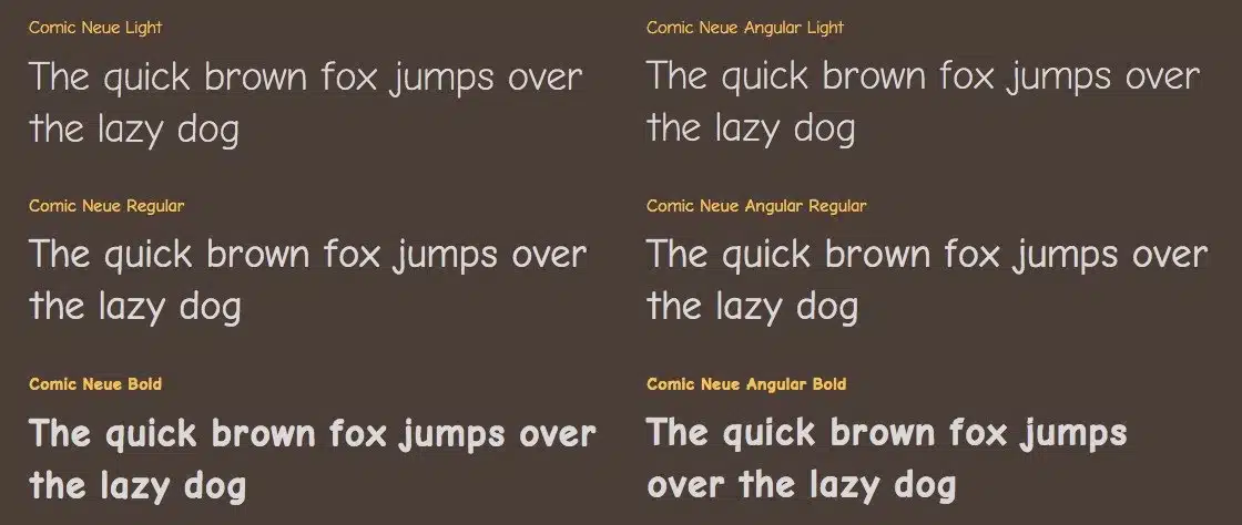
Ok, not sure what he’s talking about there when describing Comic Sans as popular, but everything else about that statement kinda makes sense. It’s also available in two different versions – Comic Neue and Comic Neue Angular, which features angular terminals rather than round. That is very 2014, right, but I’m still not convinced that this font is going to take over the world like Rozynski seems to intend. It does look way better than Comic Sans though, I’ll give him that.
You can check out a few variations of what Comic Neue looks like below, and if you want to download it Rozynski is offering it up as a free download although only for a limited time, so if you want Comic Neue in your life make sure you’re quick.
☛ More Comic Sans: Comic Sans On The New York City Subway
☛ More Fonts: Clever Teenager Figures Out Ingenious Way To Save The U.S. Government $400 Million


