The Most Famous Map Of The World Is Completely Inaccurate
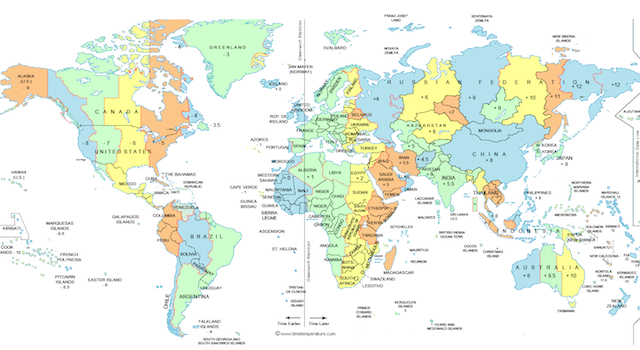
In 1974 – over 400 years since the Mercator Map was first introduced – Dr Arno Peters, a German historian and cartographer, resolved to do something about it and devised the Peters Projection map in order to create a realistic perception of the world. On this map he corrects the Northern Hemisphere size bias and every square inch on the map represents 158,000 square miles on the Earth’s surface.
Here’s what the Earth really looks like. Click to enlarge if you wish:
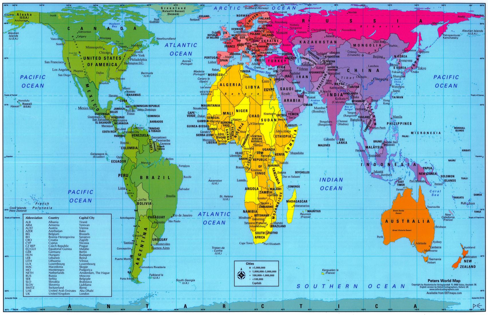
Unfortunately, despite being more accurate, hardly anyone knows about the Peters Projection map and classrooms, businesses and pretty much everyone in the world continues to use the Mercator Map. Although there is value in this map for navigating, it now seems as though it’s time for this map to be made obsolete and for the world to adopt the Peters Projection map as its first choice.
To be fair, they might get a lot further if the official Peters Map website didn’t look like it was made by someone in year 6 at the turn of the millennium, but we can but hope future generations might embrace it.
☛ More Maps: Cunts Map Of London