Neon Sign Customization Tips: Colors, Fonts, Sizes, and Placement Ideas That Work
A personalized sign looks best when every detail has a reason behind it. From colors and
fonts to size and placement, each choice affects how your neon sign looks in the final space.
This guide shares simple customization tips to help you design a sign that is clear, attractive,
and useful for daily display.
Why Customization Matters When Designing a Neon Sign
Customization gives you control over how the sign looks and what it says. It helps you create
something that fits your room, brand, event, or storefront instead of settling for a ready
made design that may not match your space.
A Personalized Sign Should Match Its Purpose
Before choosing colors or fonts, decide where the sign will be used. A shop sign needs to be
sign should look good in photos. Custom neon signs work best when the design supports the
easy to read from a distance. A bedroom sign can feel softer and more personal. An event
purpose first.
Small Design Choices Can Change the Final Look
Tiny design choices can make a big difference. A thin font may look stylish online but weak
on a large wall. A bright color may look exciting in a preview but too strong in a small room.
This is why you should think about wall color, lighting, viewing distance, and daily use before
finalizing the design.
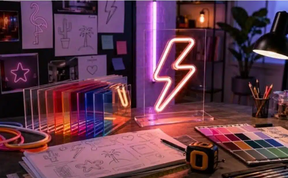
Start With the Right Message or Custom Neon Letters
The message is the first thing people notice. It can be a brand name, personal name, phrase,
quote, initials, logo, or symbol. Custom neon letters make the design feel personal, but the
words should still be simple and easy to understand.
Keep the Text Short and Clear
Short wording usually works better than long text. A few clear words are easier to read,
photograph, and remember. For a business, use a brand name, short tagline, or product
related phrase. For a room, use a name, short quote, or favorite word. Long sentences can
look crowded, especially in smaller sizes.
Choose Words That Fit the Space
The wording should match the place where the sign will go. A playful phrase may suit a cafe,
party wall, or game room. A clean brand name may work better for a salon, office, clinic, or
boutique. If you are using custom neon letters for a business wall, make sure the words
match your brand tone and customer expectations.
Use Brand Names, Quotes, or Initials Thoughtfully
Brand names work well for storefronts, counters, reception walls, and event booths. Quotes
work better for bedrooms, studios, lounges, and photo backdrops. Initials can suit weddings,
personal rooms, and creative corners. If you want custom neon name signs, keep the name
readable and avoid fonts that make letters blend together.
Choose Neon Sign Colors That Fit the Mood and Background
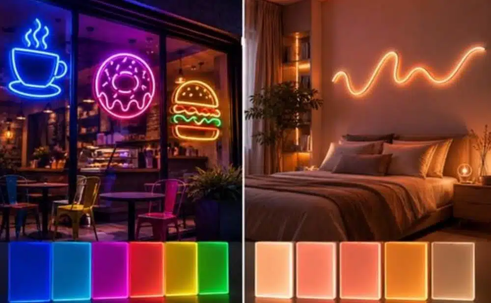
Color can change the full mood of the sign. It also affects how readable the design looks on
the wall. The best color is not always the brightest one. It is the color that fits the space and
stands out clearly.
Pick Bright Colors for High Visibility Areas
Bright colors are useful for storefronts, cafes, salons, bars, gyms, and event booths. Red,
pink, blue, yellow, green, and orange can help the sign catch attention quickly. If the sign
needs to be visible from outside or across a room, choose a color with strong contrast
against the background.
Use Softer Colors for Bedrooms, Studios, and Lounges
Softer colors work well in spaces meant for comfort or personal use. Warm white, soft pink,
ice blue, and gentle yellow can create a calmer feel. These colors suit bedrooms, nurseries,
creative studios, home offices, and lounge areas. They add glow without making the room
feel too bright.
Match the Color with Wall Paint, Decor, and Lighting
Before choosing a color, look at the wall paint, furniture, nearby lights, and decor. A white
sign on a white wall may not stand out enough. A red sign may feel too strong in a room with
many warm tones. People often search for neon light signs by color, but the smarter choice
is to pick a color that works with the full space.
Select Fonts That Are Stylish and Easy to Read
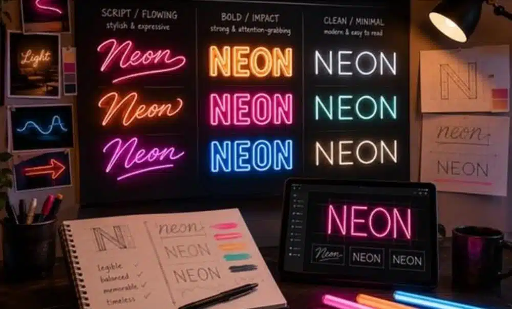
Fonts affect style and readability. A font can make the sign feel modern, playful, romantic,
bold, or minimal. Still, the sign should be easy to read when lit.
Use Bold Fonts for Business Signs
Bold fonts are a good choice for stores, offices, reception walls, trade show booths, and
brand displays. They are easier to read from a distance and look clear in photos. A bold font
can also make a business name feel stronger. If you are designing custom LED signs, keep
readability as the first priority.
Try Script Fonts for Names, Quotes, and Events
Script fonts can look beautiful for names, weddings, quotes, bedrooms, and creative spaces.
They add a softer and more personal touch. Make sure each letter remains clear, especially if
the word is long. Some script fonts connect letters too closely, which can make the final sign
harder to read.
Avoid Fonts That Look Confusing When Lit
A font that looks clear on a computer screen may look different when turned into a glowing
sign. Very thin lines, tight curves, and complex letter shapes can reduce readability. Before
approving the design, check the preview carefully. If any letter looks unclear, choose a
cleaner font.
Pick the Right Size Before You Order
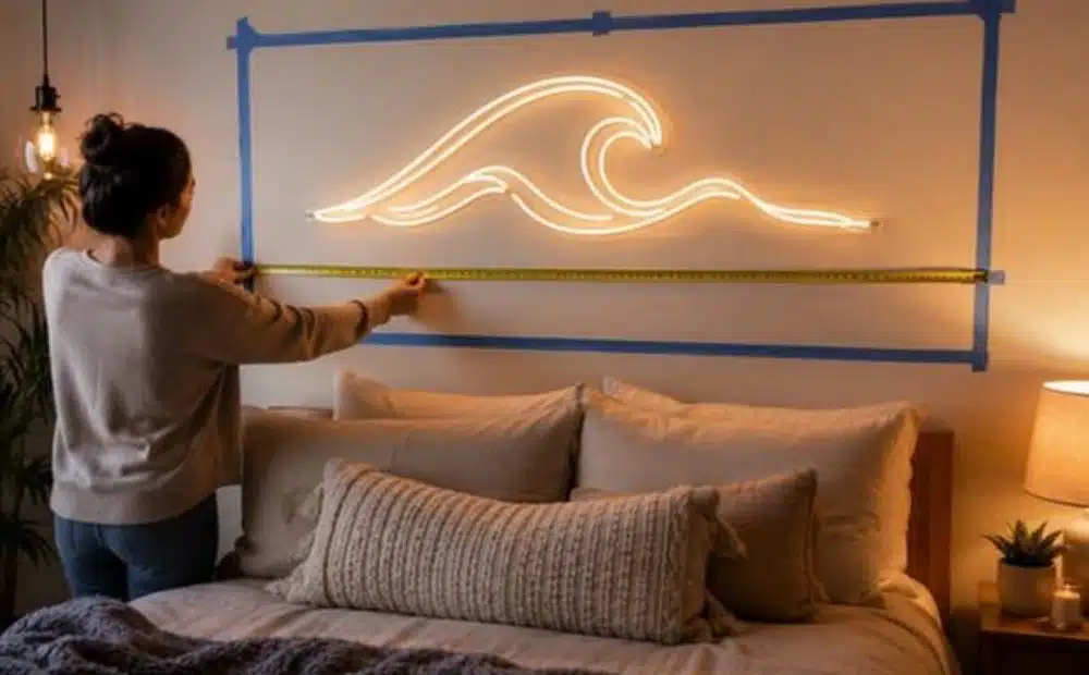
Size is one of the most important customization choices. A sign should feel balanced in the
space. It should not look lost on a big wall or cramped in a small area.
Measure the Wall, Window, or Backdrop
Start by measuring the exact area where the sign will go. Check width, height, furniture
placement, and nearby decor. You can use tape to mark the sign size on the wall. This gives
you a better idea of how it will look once installed.
Match the Size with Viewing Distance
A sign viewed from far away needs larger letters. A sign for a bedroom wall or desk area can
be smaller. Storefronts, reception walls, and event backdrops usually need more width so
the text remains visible in real use. A custom LED sign should be chosen based on how far
people will stand when they see it.
Leave Enough Empty Space Around the Sign
Do not fill the entire wall with the sign. Empty space around the design helps it stand out
and makes it easier to photograph. This is especially important for product displays, photo
booths, and seating areas. A sign with breathing room often looks more polished than one
squeezed between shelves or frames.
Plan Placement for Better Visibility and Daily Use
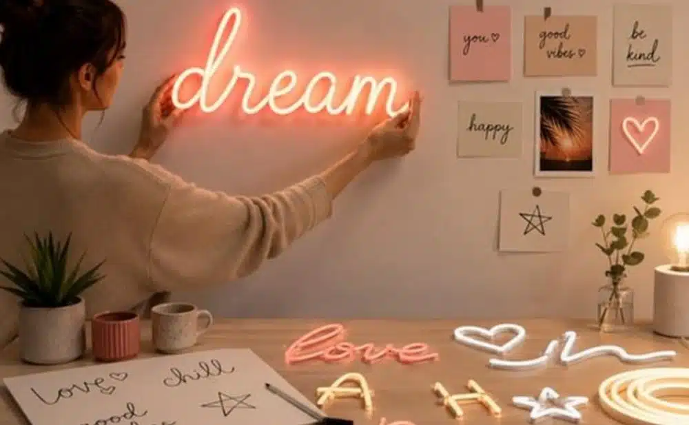
Placement decides how often people notice the sign. A good design can lose impact if it is
hidden in a corner, blocked by furniture, or placed too high.
Storefronts, Reception Walls, and Checkout Counters
For businesses, high visibility spots work best. Storefront windows can attract passersby.
Reception walls can create a strong first impression. Checkout counters keep the brand
visible at the final point of contact. Custom LED neon signs are useful in these spots because
they can add light, style, and brand recall without taking up floor space.
Bedrooms, Gaming Rooms, and Personal Corners
For home spaces, place the sign where it feels natural in daily use. Above a bed, beside a
desk, near a mirror, or behind a gaming setup can work well. The sign should add character
without overwhelming the room. Softer colors and medium sizes usually work better for
personal spaces.Events, Photo Booths, and Brand Displays
Events need signs that photograph well. Place the sign where guests naturally stop, pose, or
gather. Flower walls, stage backdrops, dessert tables, entry arches, and booth walls are good
options. If the sign is part of a business display, make sure the brand name is not blocked by
people, decor, or products.
Think About Materials, Mounting, and Power Access
Customization is not only about looks. A sign should also be safe, easy to install, and
practical for its location.
Choose Durable LED Neon Materials
Many modern signs use flexible LED neon tubing because it is lighter and easier to handle
than traditional glass neon. This makes it suitable for homes, stores, events, and offices.
Custom LED signs can offer the glowing look people want with easier installation and
everyday use.
Select the Right Backboard Style
The backboard supports the design and affects how the finished sign looks. Clear acrylic
gives a clean look. Cut-to-shape backing follows the outline of the design. A rectangular
backing can offer more support for larger signs. Choose the style based on your wall, decor,
and how often the sign may be moved.
Check Outlet Access Before Finalizing Placement
Before approving the design, check where the nearest outlet is located. A great sign can look
messy if the cord has to stretch across the wall or floor. Plan the wire path in advance.
People ordering led signs custom made should check cord length, adapter type, dimmer
option, and plug details before checkout.
Common Customization Mistakes to Avoid
Many design mistakes happen when people choose based only on how the sign looks in a
preview. A good sign should also work in the space where it will be used.Using Too Many Words in One Sign
Too many words can make the sign hard to read and more expensive to produce. Short text
is usually cleaner and stronger. If you have a long message, consider shortening it or turning
it into two design elements.
Choosing Color Without Checking the Background
A color that looks bright online may not stand out on your wall. Always compare the sign
color with the background. Dark walls, light walls, mirrors, glass, and textured surfaces can
all change how the sign appears.
Ignoring Readability for Style
Style matters, but readability matters more. For a neon sign custom order, make sure people
can read the design quickly. This is especially important for brand signs, storefronts, event
booths, and logo displays. A sign should be attractive and useful at the same time.
Summing it up…
The best custom neon signs are planned around real use, not only appearance. My
suggestion is to start with the placement, then decide the size, wording, font, and color. This
makes the final design easier to read, better balanced, and more likely to fit the space well.
If you want a personalized sign for a business, event, room, or brand display, NeonChamp
offers custom options that can be designed around your purpose and placement. A good
sign should feel personal, look clear, and keep working for your space long after it is
installed.