

This Climate Change Map Doesn’t Look So Good For Africa And Asia
Climate change has long since evolved from fiction into fact with effects being felt across the globe. Dry regions are becoming dryer and wet places wetter, with major weather events becoming more intense and occurring at an increasing rate. So what has the scientific community gone and done about it? Only produced a map to show us just how fucked we are and who in particular is going to bear the brunt of natures altering climate.
The above map shows in red which countries are most likely to be affected by climate change over the next few decades, based on both the severity of the effects and their state of readiness to deal with the probable outcomes. Fortunately for people in the UK and Australia things are looking pretty cozy with the Scandinavians once again proving that they are just god damn better than the rest of us when it comes to nature.
Featured Image VIA
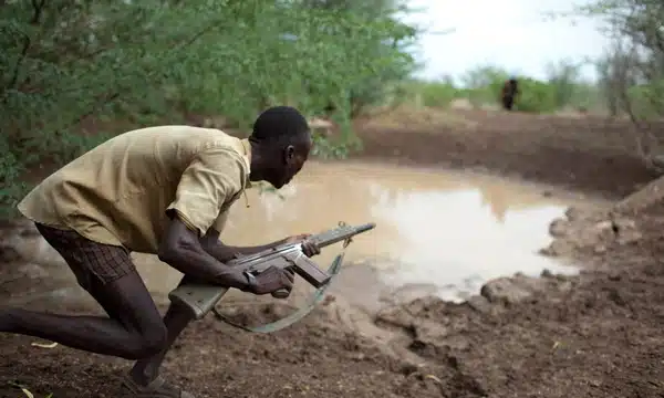
Image VIA
While the westernised world and China has undoubtedly contributed the most to climate change over the last century, it once again looks like the less developed nations are going to pay the price for our bad decision-making.
Africa is already suffering from water shortages that look set to drive countries like Somalia, Niger and Kenya closer to conflict over the vital resource. India and Pakistan don’t need many more reasons to whip out the nukes so lets hope we get something sorted soon and prove this guy wrong.


