
When you think of a map of the world you probably think of the one that sits at the top of this article in all its glory. You’ve probably seen this map millions of times, be it at school during a geography lesson or when you’re on a plane looking through their magazine whilst you’re waiting for take off. This map is known as the Mercator Map, and although it fits all the countries in the world onto a map, it’s completely inaccurate.
But why? The Mercator Map was first drawn in 1569 and was primarily used for navigators who were shipping goods all over the world. The map itself was devised in Germany at this point, and as is the case with most map makers they placed their country of origin at the centre of the map. As such the equator was placed halfway down the map, rather than 2/3 of the way down the map where it should actually be placed if all the countries are represented by their relative sizes.
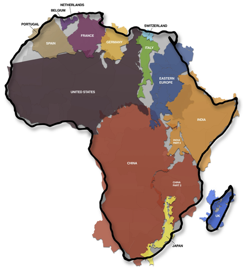
As such, the map becomes distorted. For example, Mexico is larger than Alaska but on the Mercator Map it looks as though it is three times smaller. Europe also looks bigger than South America when in fact South America is roughly twice the size of Europe. Africa is grossly misproportioned too, as you can see by this map which depicts how big that continent actually is relative to other countries in the world:
☛ More Maps: The Autocomplete Map Of The United Kingdom
Find out what an actual map of the world looks like over the page: